Huntlee
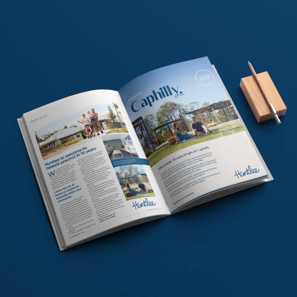
Bringing Caphilly to life
- Art Direction
- Asset Creation & Rollout
- Brand Identity
- Campaign
- Copywriting
- Graphic Design
- Logo Design
- Place Branding
The Challenge
In the vibrant tapestry of the Hunter Valley, Huntlee emerges, a gleaming thread. This Award-Winning Masterplanned Community in North Rothbury is more than just a place; it’s the epitome of thoughtful, affordable living. But in a sea of housing developments, what truly sets one apart? Our mission was to illuminate the forthcoming precinct in Huntlee Town Centre and craft a narrative that lets people envision a vibrant place to live, work and play.
Our Approach
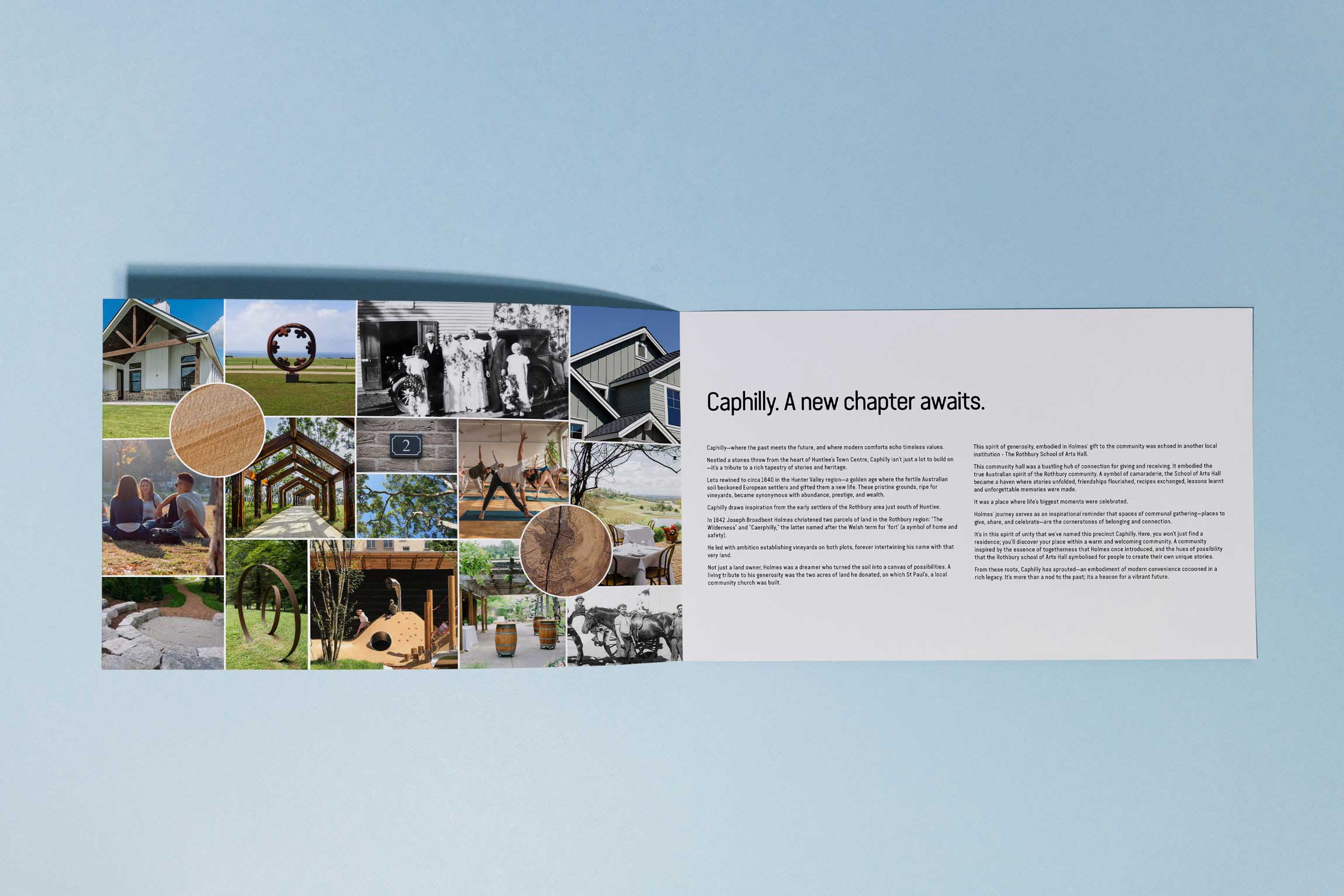
Drawing from our historical deep dive, we fashioned a typographic logo, a nod to the North Rothbury School of Arts, coupled with modern styling. The Caphilly ‘loop’ serves as a visual tribute to the Hall of Arts Hall – a symbol of community, connectivity, and forward momentum. By leaning into Caphilly’s rich narrative, we crafted engaging messages, painting a vivid picture of life in this unique enclave. Our focus? First home buyers, families, dynamic duos and small families in the Hunter Valley and Western Sydney.
The Results
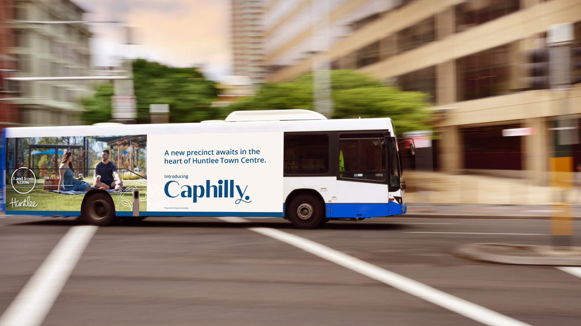
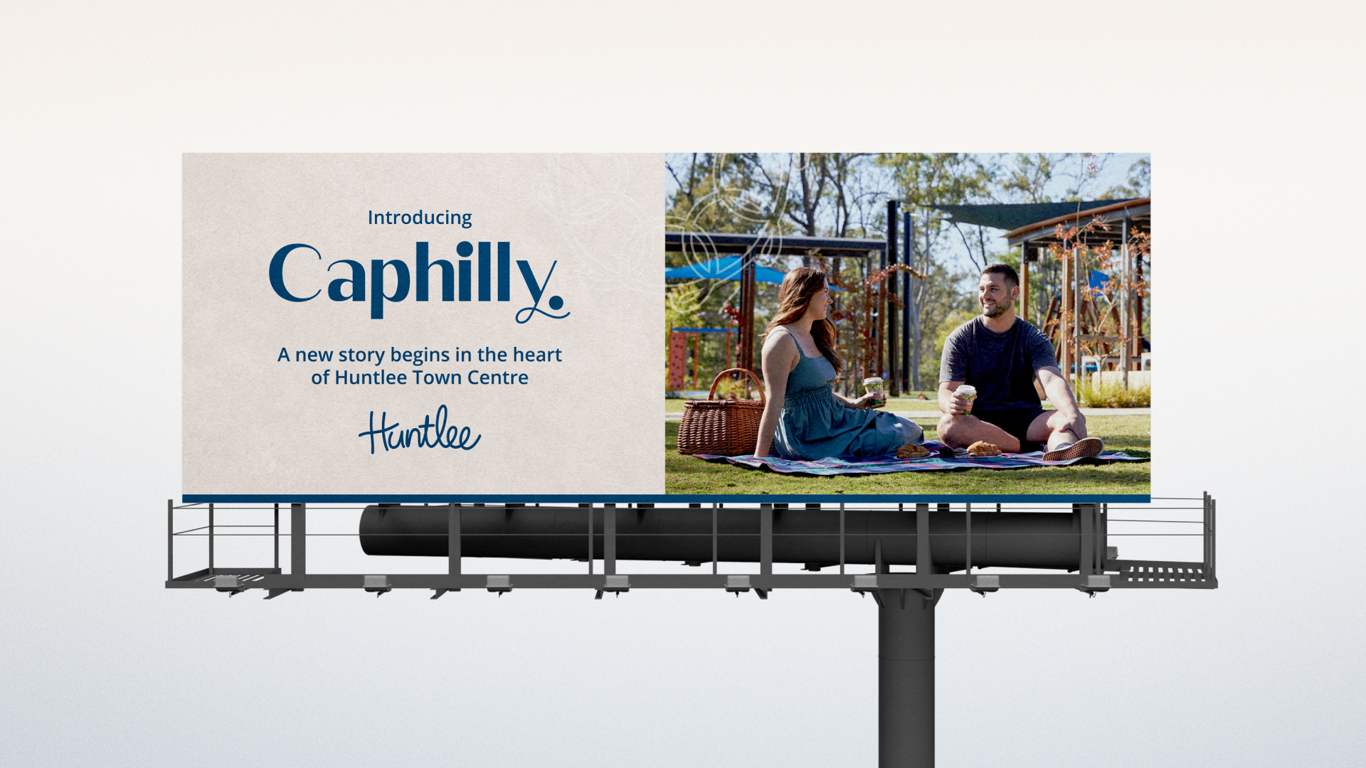
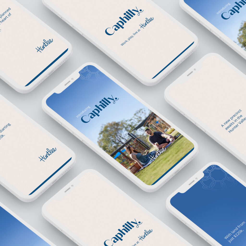
We unveiled the Caphilly campaign, perfectly timed with the onset of spring – a season synonymous with fresh starts and new beginnings. Our campaign was featured in publications like Insight Magazine, Newcastle Weekly, and The Urban Developer. We also showcased curated digital ads on platforms such as HUNTERHunter, complemented by the precision of Meta and Google Ad placements. This masterful blend of digital and classic media, highlighted by billboards, bus signage, and a captivating TVC ensured a comprehensive and impactful reach for Caphilly. The result is a timeless new precinct that will grow, flourish and become a place people call home for years to come.
The outstanding results, including a surge in inquiries, vibrant social media interactions, and heightened buyer interest, underscore OOTS’s significant contribution to positioning North Rothbury as a desirable suburb and solidifying Huntlee’s presence on the map.
Similar projects

Ampcontrol
An energising rebrand

Soul Hub
The evolution of Soul
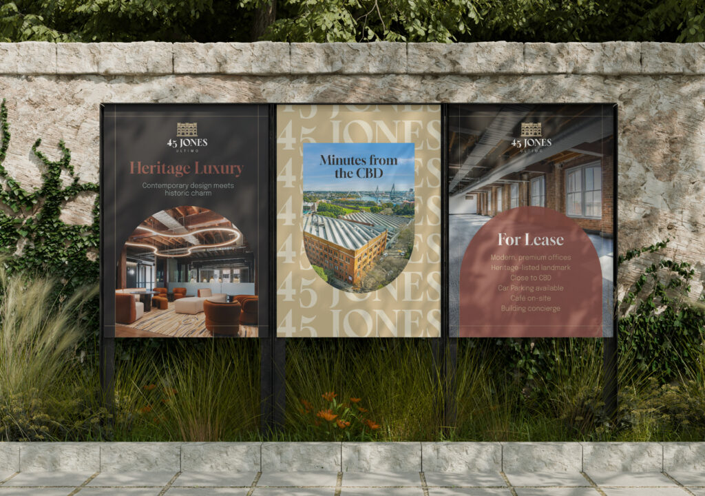
TOGA – 45 Jones
45 Jones Brand Identity & Website

Vail Resorts
Epic Australia Pass
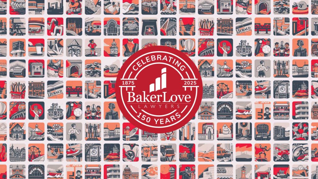
Baker Love Lawyers
Celebrating 150 years

Glencore
A better balance

Engenicom
Engineering a bold new presence
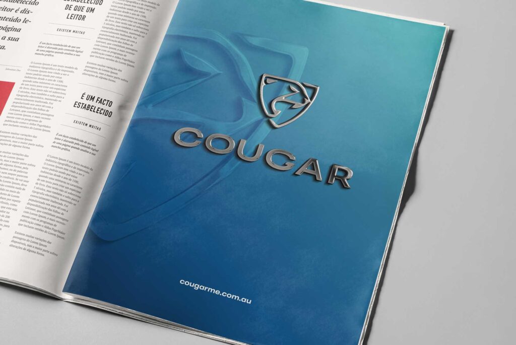
Cougar
Modernising for growth
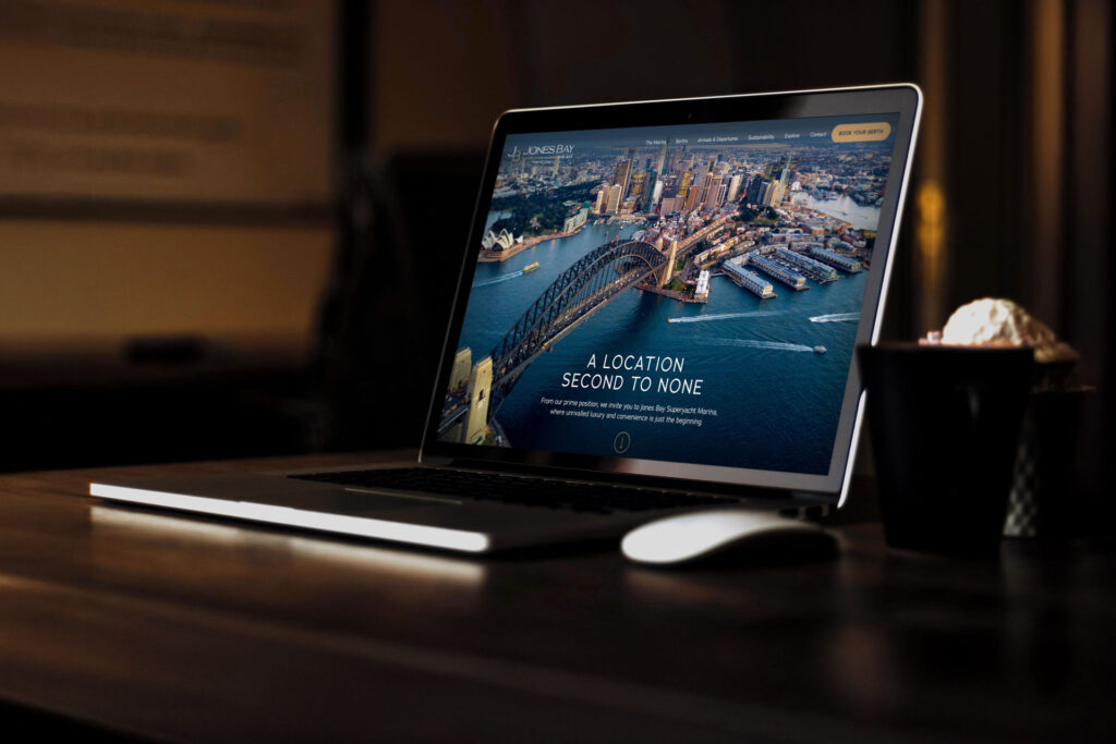
Jones Bay Superyacht Marina
Redefining Sydney’s premier marina
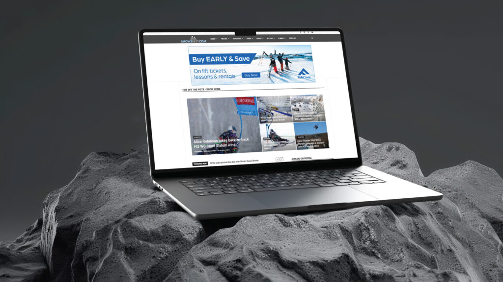
Vail Resorts
A multi-brand experience

BlackWolf
Reinventing premium adventure
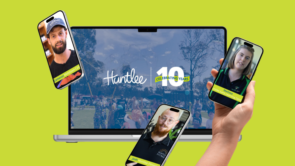
Huntlee
10 years at Huntlee

Pro-Torque
Brand fuel

Cordel
Turning innovation into impact

Greater Bank
Be. Live. Bank Greater!
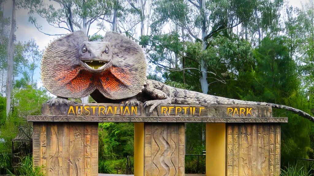
Australian Reptile Park
Singing animals, smiling families
Port of Newcastle
A seamless transition
