Ampcontrol had the innovation and the credibility. What they needed was the recognition. Together, we helped craft a bold brand evolution that positioned them as leaders in the global energy revolution.
The Challenge
From a small Newcastle shed in 1968, Ampcontrol has grown into Australia’s largest privately-owned engineering company, delivering pioneering solutions across energy, infrastructure, and resources. Yet awareness of the brand remained low, particularly outside its core mining markets. With many still seeing Ampcontrol as “just mining,” the company’s diverse offering and bold push into renewables and decarbonisation weren’t cutting through. The challenge: redefine the brand to reflect a new vision and launch a campaign that positioned Ampcontrol as a leader in the global energy revolution.
Our Approach
Partnering with GUTS Creative, we conducted extensive research with 385 stakeholders to uncover Ampcontrol’s strengths and gaps. While trust and innovation were clear, the brand needed a sharper proposition. A new foundation was set:
Vision: To lead the global energy revolution
Purpose: Transform the world through collaboration
Value Proposition: To challenge the future
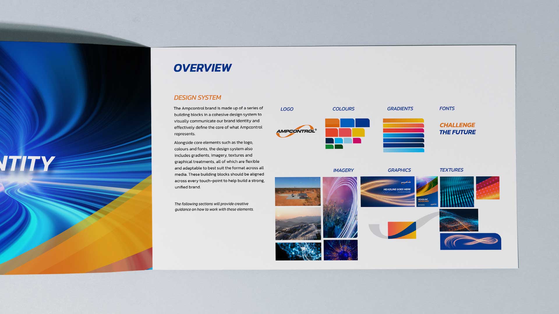
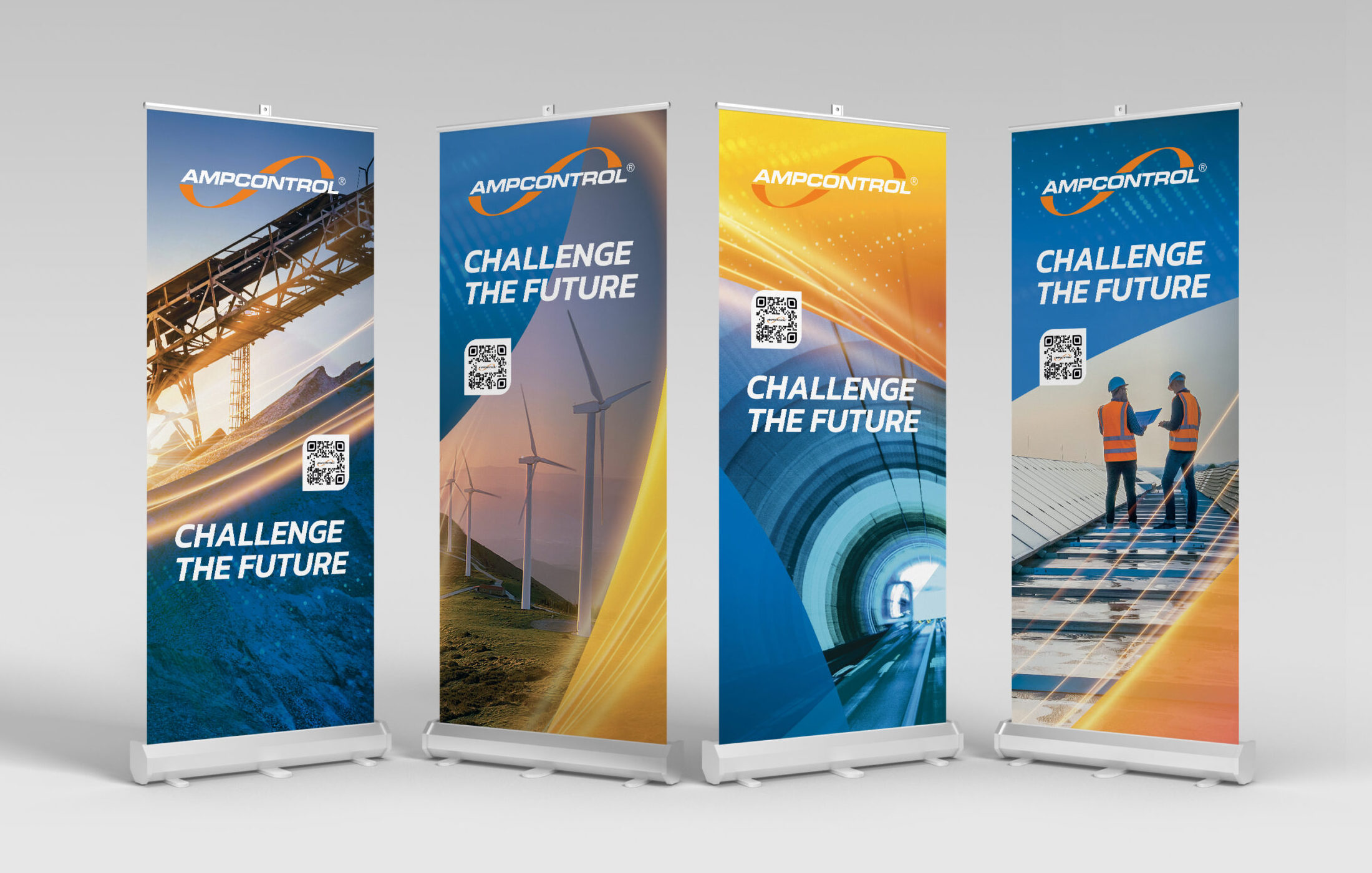
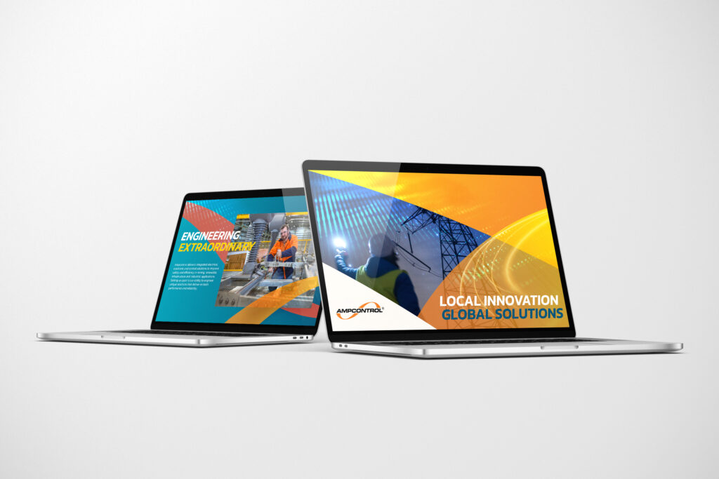
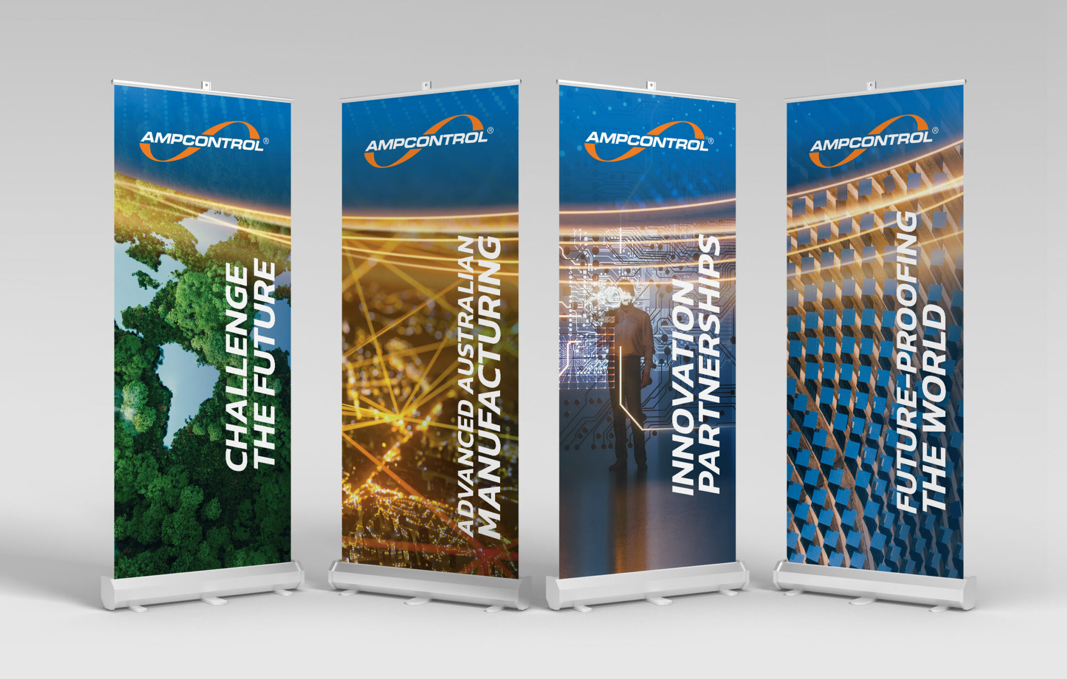
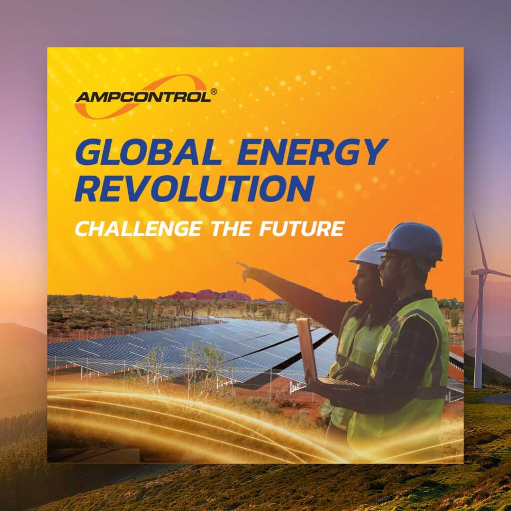
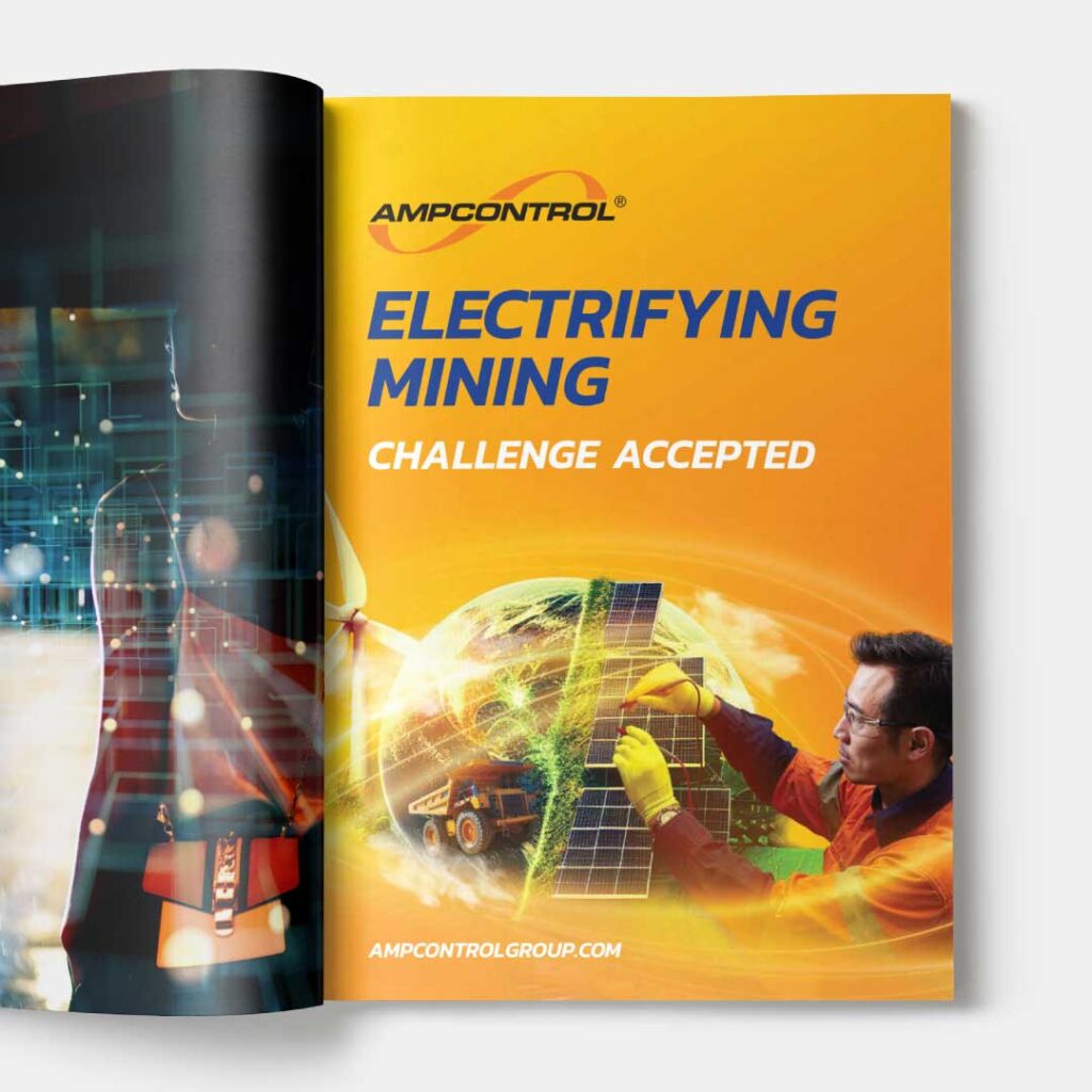
We then brought this to life through a bold new identity that shifted Ampcontrol from technical to inspiring. The visual system was built around energy, movement, and transformation — using dynamic gradients, layered forms, and modular “building blocks” to reflect innovation and adaptability. A vibrant yet confident colour palette broke away from traditional industry tones, while bold typography and striking imagery gave the brand presence and authority.
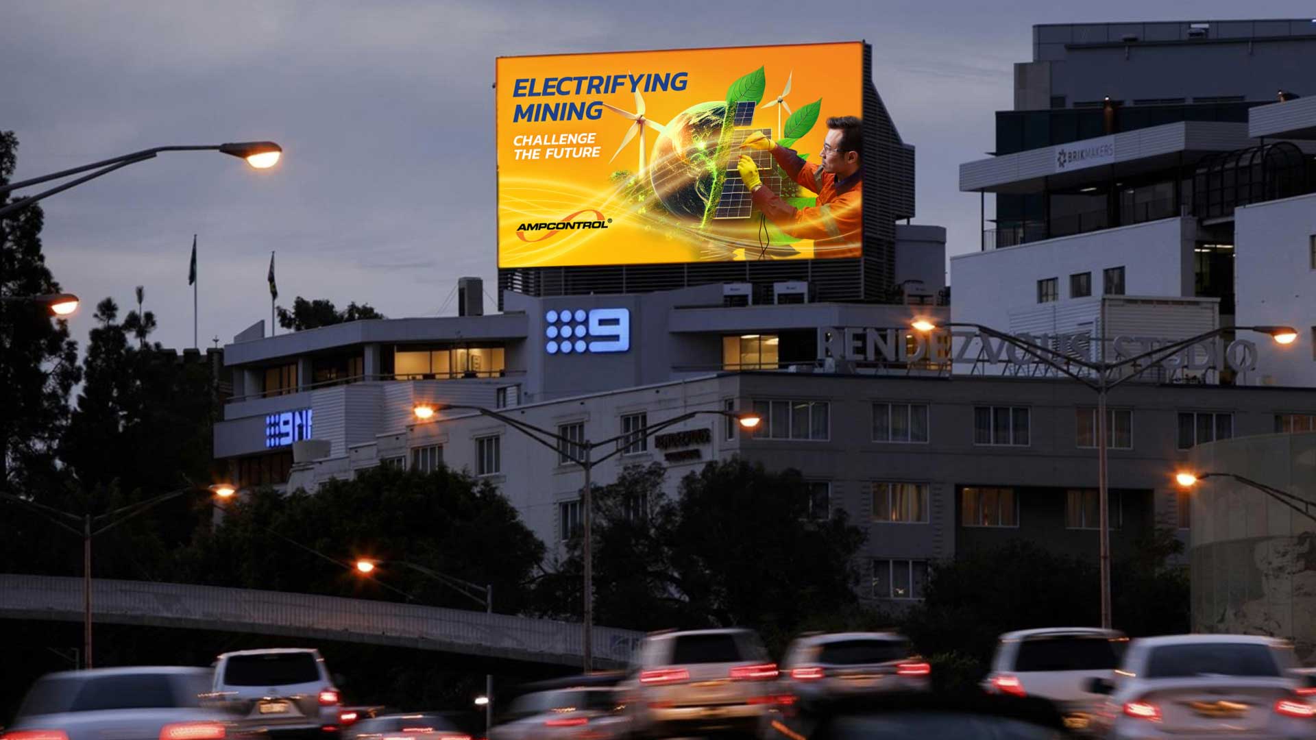
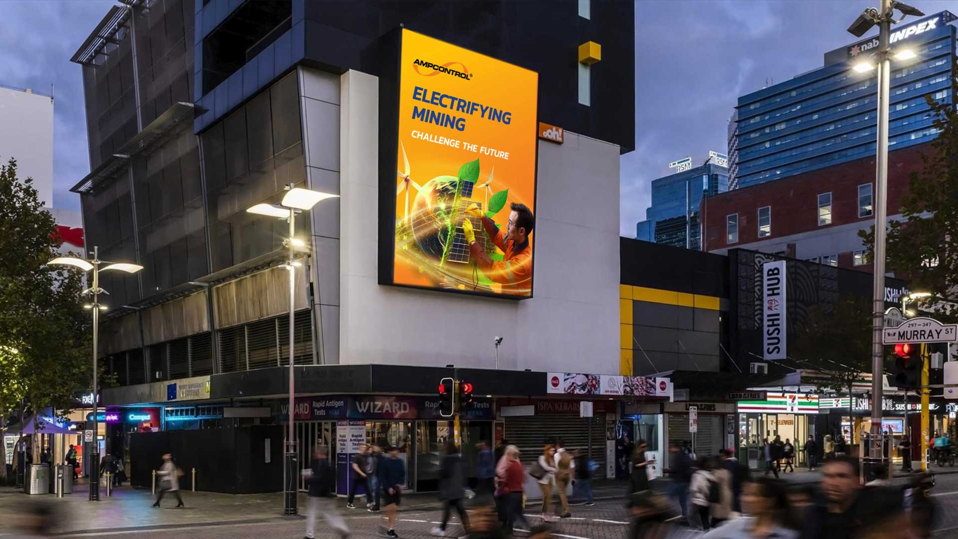
The launch campaign, Challenge Accepted, extended this identity into market. Targeting Western Australian mining decision-makers, high-impact creative was placed in airports, along key routes, and at the Electric Mine Conference in Perth. Billboards, digital ads, and a brand film showcased Ampcontrol’s innovation and ambition, cutting through a crowded B2B landscape.
The Result
The rebrand delivered a cohesive design system and versatile toolkit, equipping Ampcontrol with consistency across every touchpoint. The campaign generated 11.8 million impressions, a 289% lift in enquiries, and a 270% rise in conversions, welcoming 35,800 new website users. The result? Record financial performance, recognition in the AFR’s Most Innovative Companies list, and a brand firmly positioned as a driver of the global energy transition.