Victory Toronto
A Boutique Project

Newcastle has embraced apartment living in a big way. As a result, there are a lot of apartments now – in planning, being built or recently completed. A new developer in Toronto wanted to launch a boutique project, right across the road from the lake. They had a name, based on the street – Victory. Challenge accepted.
It always makes the job easier when the product is actually good. Passionate, local developer – tick. Well designed, bigger than average apartments with quality fittings – tick. Stunning location – tick. Appealing lifestyle aspects we don’t have to make up – tick. So far, so good.
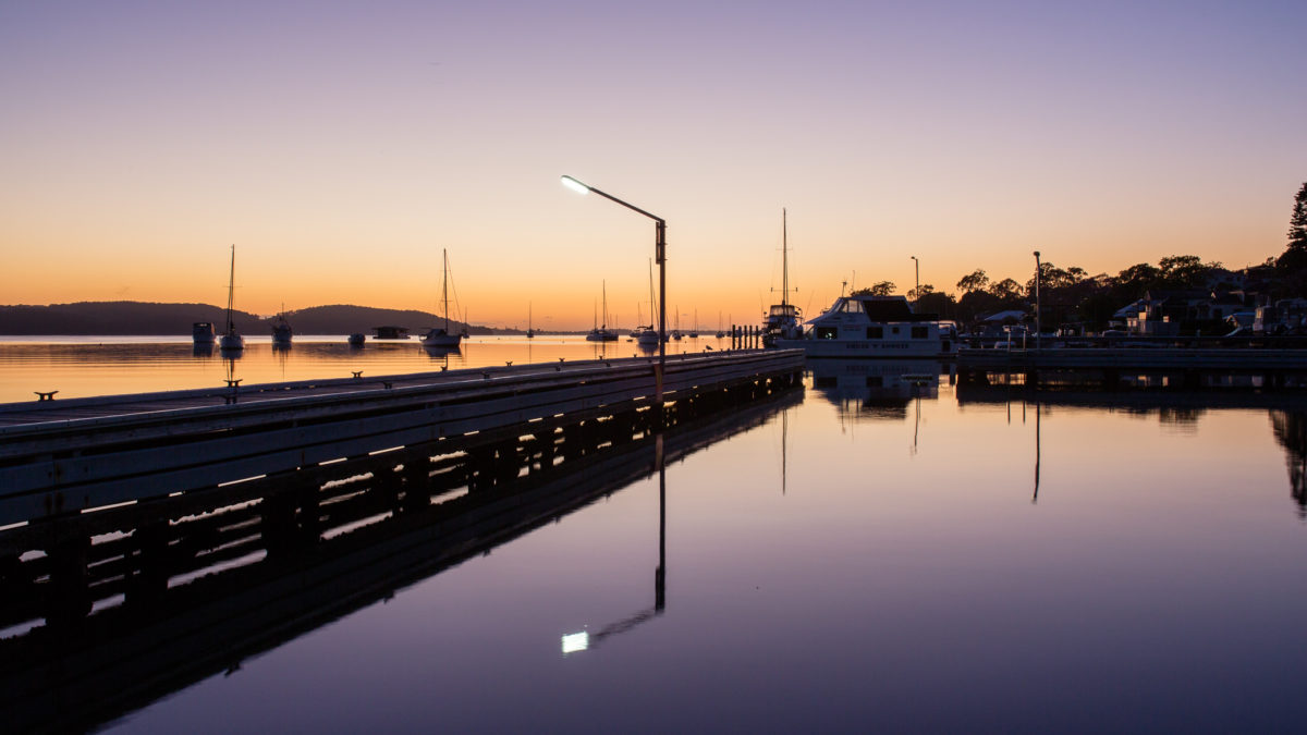
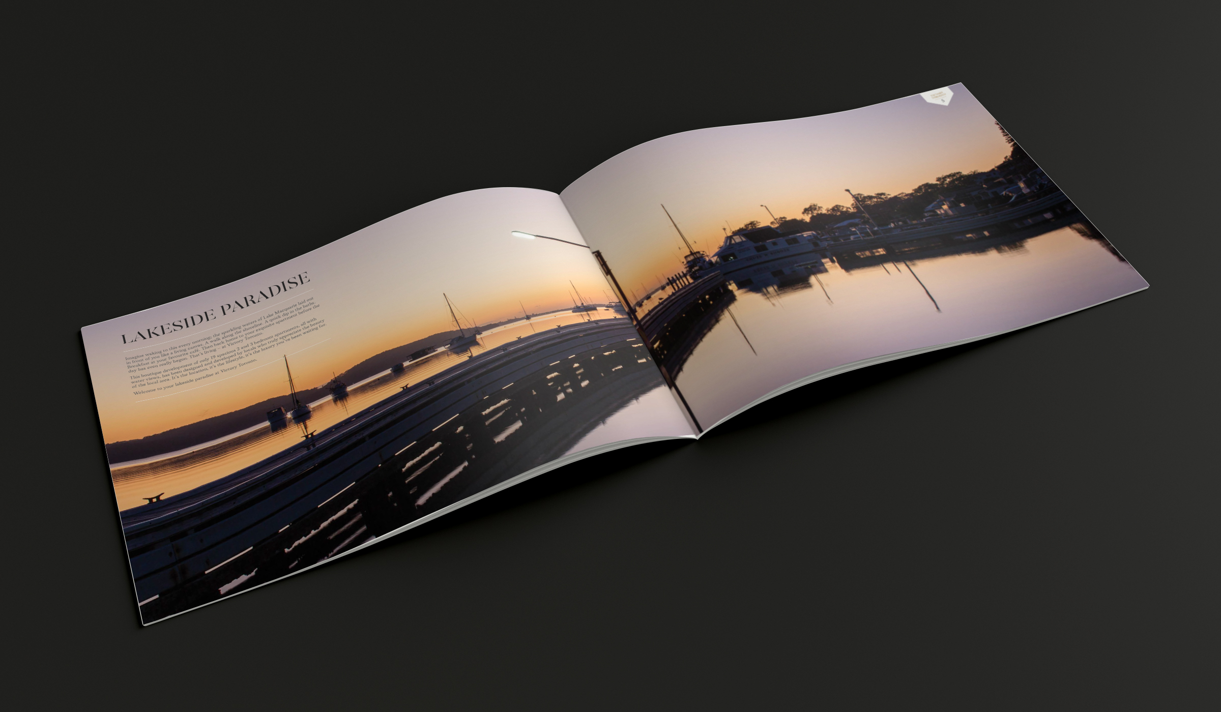
First task was to create an identity. The name was set, so the look had to live up to it. We curated a luxurious palette of black and gold to set the scene. A stylised V-shaped shield icon paired with a dramatic stencil/serif font created a bold impression – this is high-end luxe development, confidently designed but not ostentatious. Design elements like black marble textures are used sparingly to enhance the elegance. And the commissioned photography by Edwina Richards captures the lifestyle aspects of Toronto’s lakeside village perfectly with sun-kissed dawn images all sparkly water, contrasty shadows and moody vistas. Even the cafés and supermarket look sophisticatedly casual.
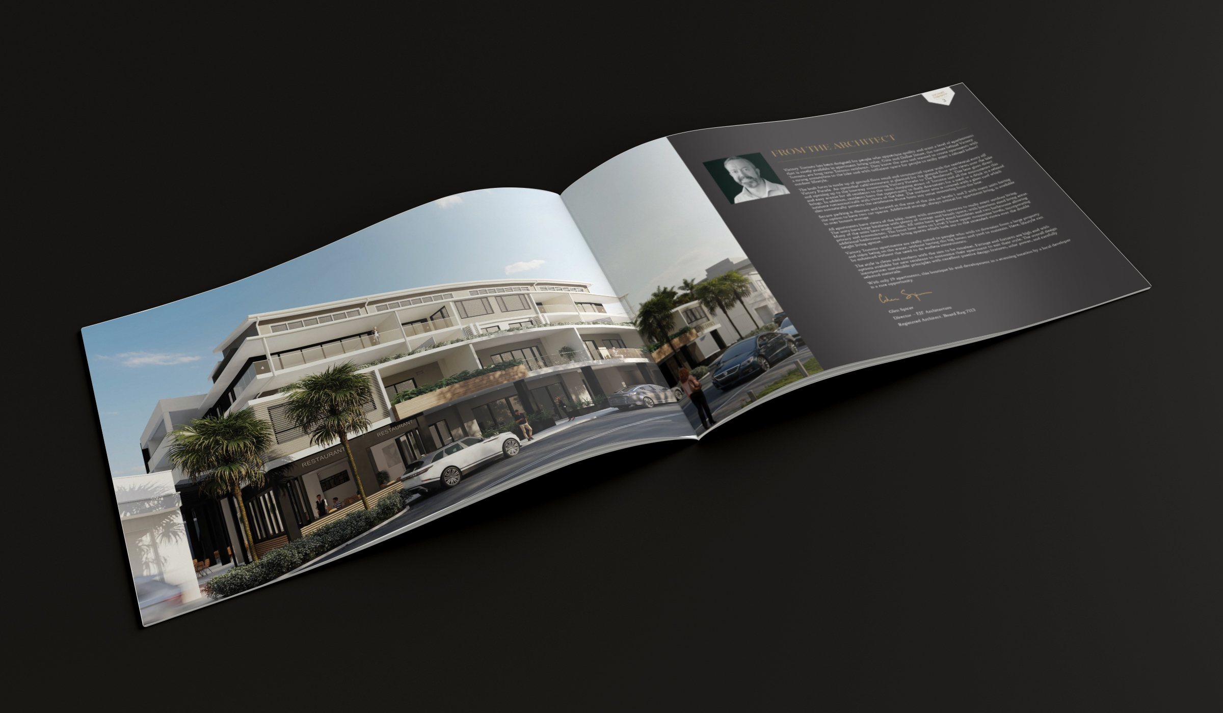
Look approved, it was rolled out across all the touch-points including press, flyers, hoardings and online. The most challenging was the display suite. It needed to instil confidence in buyers, wow them with the development’s potential, allow them to select fittings and finishes yet also function as an office. We used the dark palette on the outside, then a lighter, brighter feel with striking images and building renders on the inside. We used similar thinking for the brochure, picking a very tactile stock and giving it a bit of bling with some gold foiling.
The website and TVC are all about intrigue and desire. They highlight the lifestyle benefits and luxury features while encouraging buyers to take the next step and register their interest.
Launch has been successful, with the development team very pleased with the rollout and initial interest. Very soon there will be some very happy residents living happily ever after beside the lake.