Committee for the Hunter
Creating an inclusive brand

The Hunter offers a rare and highly valued balance of opportunity and lifestyle. It’s Australia’s leading regional economy – generating more wealth that Tasmania, the Northern Territory or the ACT. To help attract further investment and economic development, an independent and inclusive champion representing the ten Local Government Areas (LGAs), stretching from Lake Macquarie to the Mid Coast, was formed – Committee for the Hunter. Putting major thought leaders into a single non-partisan organisation makes it easier for the region to articulate its needs when dealing with funding bodies and decision makers.
Our challenge became developing a brand that would represent a single, collaborative and unified voice for such a diverse region.
Starting from scratch, the Committee required logo design, brand architecture plus web design and development. It needed to capitalise on the Hunter’s positive brand recognition while challenging the negatives. Acting as a first port of call, their website needed to speak to other professional and governing bodies while still appearing fresh, innovative and forward-thinking.
We met with the Committee to identify themes and directions for the brand. We discovered that they really wanted to focus on being a unified voice that was inclusive, strong and trusted. We had to somehow represent all ten LGAs which had the potential to grow and develop. So how do we do that?
We mapped out the ten LGAs which make up the Committee. Taking this abstract map we separated, re-arranged and stacked the individual shapes to give the logo its unique and recognisable shape. The idea was to highlight the unity and have each LGA represented equally. This technique left room for the logo and brand to develop and grow with the Committee. Cool idea, right?
The brand architecture helps build a consistent narrative that defines how we want people to see Committee for the Hunter.
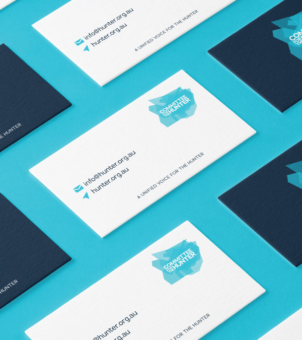
We wanted the logo to live throughout the brand. It was designed so the individual pieces could be used across all collateral as a design element to house text and imagery or as separation zones.
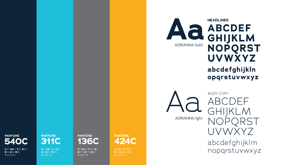
As the shape is complicated, the colour palette is deliberately modest and signifies trust, integrity and efficiency. It also represents water – the lakes, rivers, bay and ocean that tie the region together.
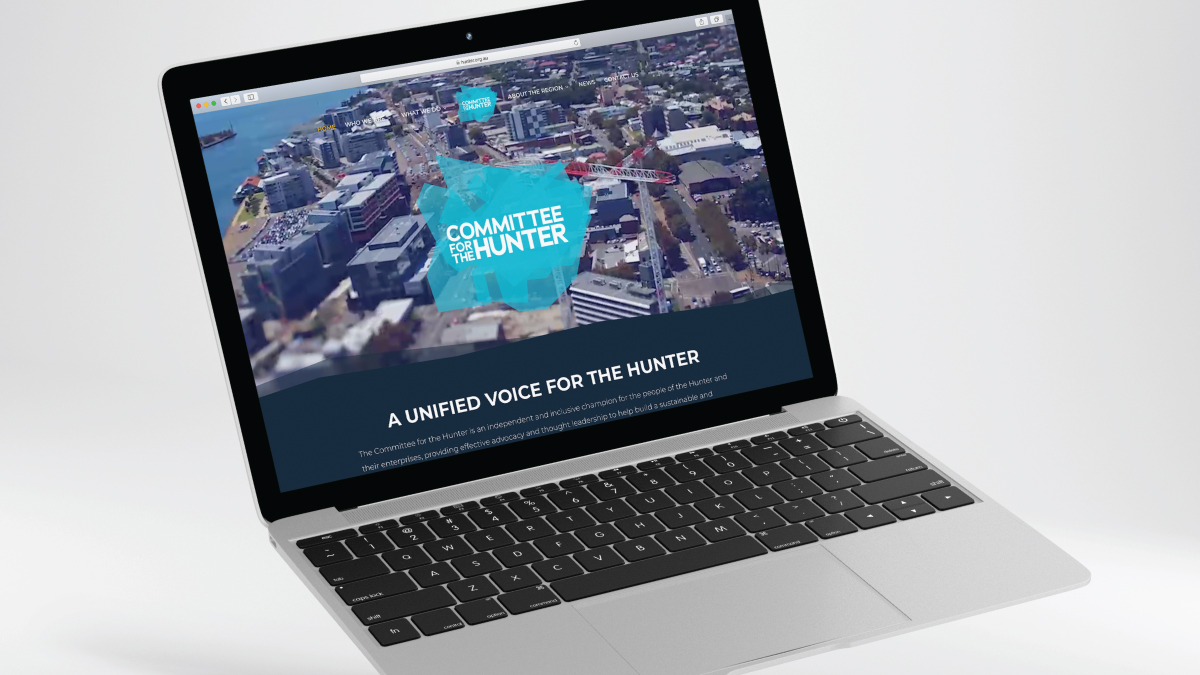
When it came to designing their website, we needed to show off the whole region to its full potential. We achieved this through beautiful full screen imagery which captures the region in all its glory. In some areas the content was quite text heavy. We broke it up with animated infographics and video to keep it interesting and engaging.
With a successful launch, Committee for the Hunter has a fresh, innovative look with an intelligent brand architecture that talks directly to their audience. The brand sits proudly among other established organisations. Their website encapsulates their brand essence and has shown consistent performance since launching. It takes visitors on a seamless journey depicting the region, promoting its benefits and showcasing all it has to offer. The Committee will put these tools to good use as its advocates for the Hunter.